Creating a Personal Logo
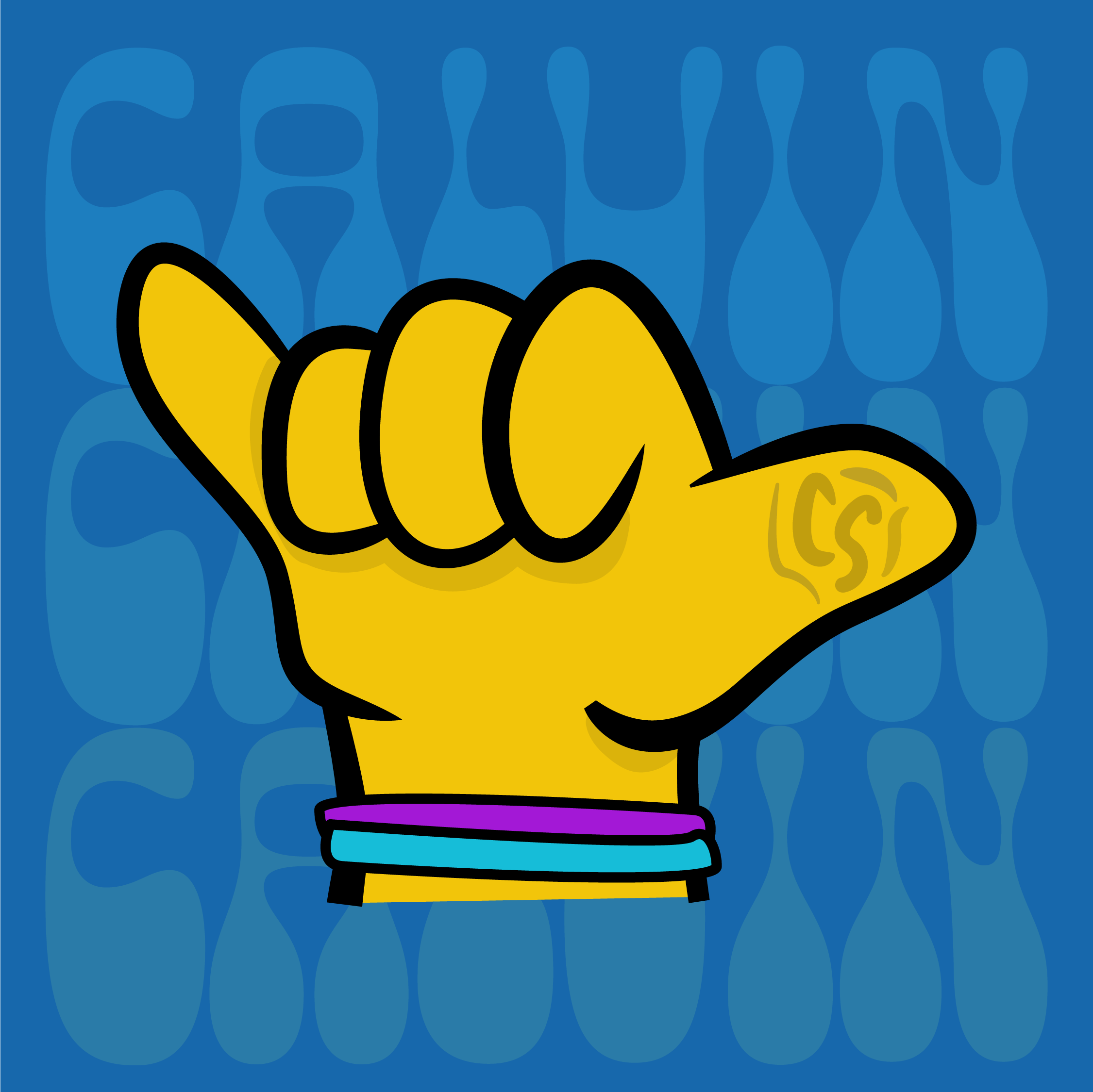
Designing a logo that gives a little introduction to me:
Initial design of a personal logo for my “Creativity, Communication, and Innovation” class
This logo was a challenge for me to make, as I often struggle with the daunting blank canvas when creating something for myself. This logo is a small collection of a few things about me that combine nicely into a clean logo. It includes bracelets that have significant meaning to me, a nod to my favorite genre of music, my initials hidden into the thumbprint, and friendly “hang loose”.
The Bracelets:
The bracelets pictured above are featured in the logo I created. I wear these two 24/7 because they have real significance behind them. I don’t wear a watch or other jewelry, but no matter what I’m wearing, these are always visible. I purchased the bracelet on the left from my friend Katie, in support of my School’s “Students Against Sexual Violence” organization. This cause is important to me, so I’m proud that I have a reminder of it on my wrist. The second, “Minga Bracelet” was purchased on a service trip in the Los Rios community in the Amazon Rainforest of Ecuador, on the Napo River. The bracelet itself supports local businesses run by women in the community.
These bracelets are immediately visible on my wrist and hold a lot of meaning. For this reason, they fit perfectly into my personal logo design.
The Font:
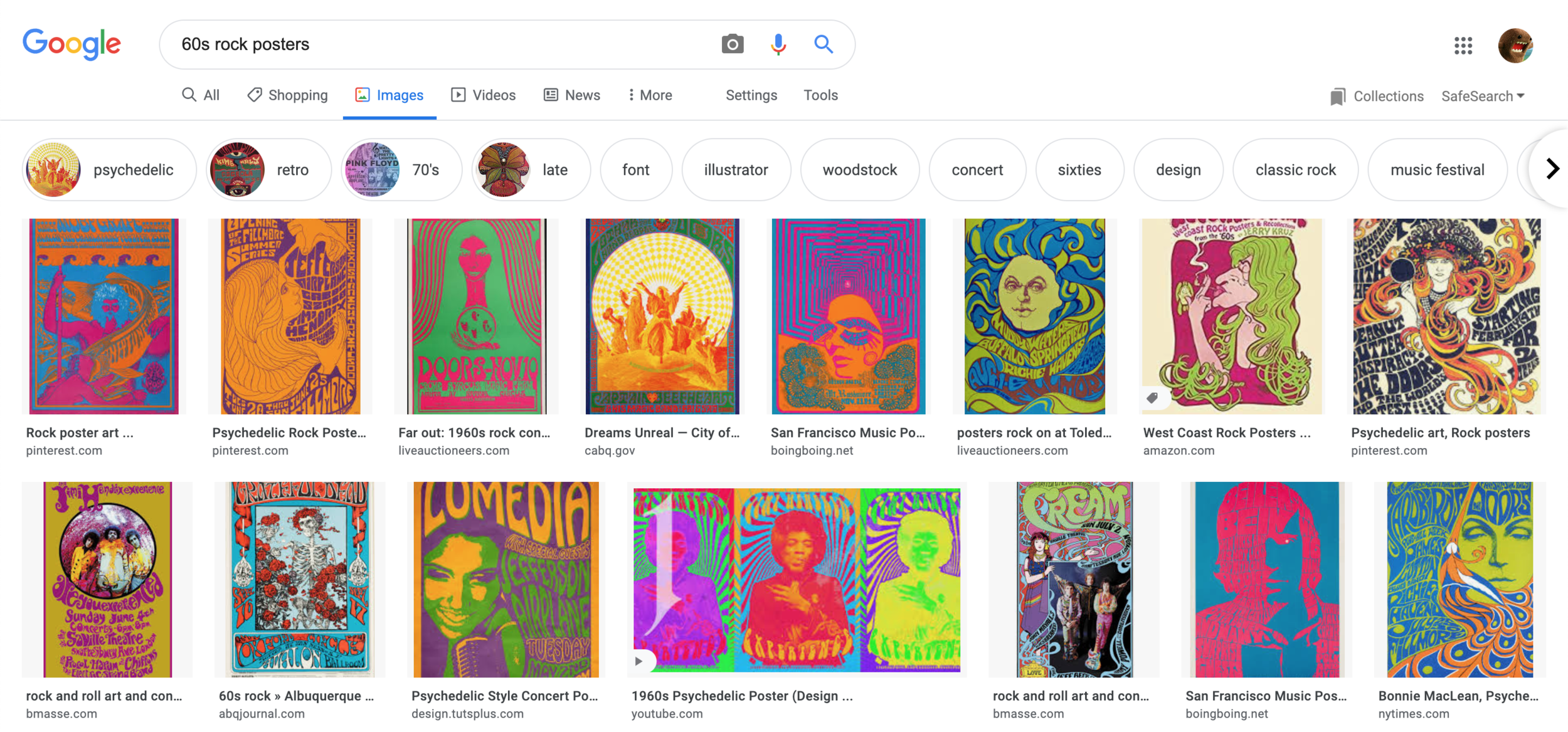
One of the more subtle design aspects of the logo is the “Calvin” stacked text in the background. The font, Cheee, is a great 60’s-style font. I picked this font because it was one of the most prominent design features of many 1960’s Rock and Roll/Psychedelic Rock posters. This part of a logo is a nod to some of my favorite artists and influences. I’ve played guitar for the a significant portion of my life now and have listened to these artists and learned so much.


